The Art of Storytelling: How Data Visualization Transforms Insights
The Art of Storytelling in data visualization is a powerful tool to convey complex information in an engaging and comprehensible manner. By combining narrative elements with visual representations, data visualization enables audiences to grasp insights quickly and intuitively. This technique not only highlights key trends and patterns, but also evokes emotional responses, making the data memorable. As Jakob Nielsen notes, well-crafted visual stories can make data accessible to a broader audience, turning statistics into compelling narratives that drive decision-making.
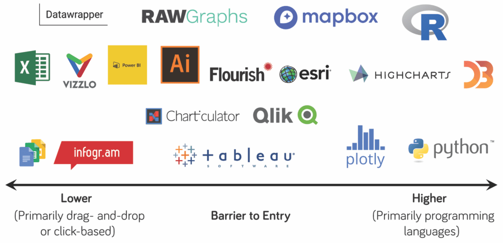
Furthermore, effective data visualization employs various techniques to create a coherent story—using charts, graphs, and interactive elements that guide the viewer through a logical flow of information. According to Datawrapper, incorporating elements such as annotations and context can greatly enhance the storytelling aspect, allowing for deeper engagement with the data. By prioritizing clarity and context, businesses can transform insights into actionable strategies, demonstrating the true potential of storytelling in data visualization.
Unlocking the Power of Data: Effective Visualization Techniques Explained
Unlocking the power of data requires more than just collecting information; it demands effective visualization techniques to transform raw data into actionable insights. Good data visualization allows stakeholders to quickly understand complex datasets and identify trends. Some widely used techniques include bar charts, line graphs, and heat maps. Each of these tools presents data in a way that highlights patterns and anomalies, making it easier to draw meaningful conclusions from typically daunting statistics. For an in-depth exploration of various visualization methods, you can refer to Tableau's best practices on this subject.
To further enhance the effectiveness of your data visualizations, consider the principles of clarity, consistency, and context. These key elements play a crucial role in ensuring that your audience can comprehend your visual data quickly. Clarity involves using simple and legible visuals, while consistency ensures uniformity in colors and formats throughout your work. Adding context helps in orienting your audience, providing them with the necessary background to understand your data's relevance. For more insights on creating impactful visuals, check out Datawrapper's guide on what to avoid when visualizing data.
Why Do Numbers Matter? Exploring the Impact of Data Storytelling
The significance of numbers in data storytelling cannot be overstated. Numbers serve as the backbone of our understanding in various fields, from marketing to healthcare, providing us with measurable insights that guide decision-making. By presenting information through quantitative data, we can transform complex narratives into easily digestible formats. For instance, according to Forbes, businesses that leverage data effectively can improve their operational efficiency and drive profitability. In a world awash with information, numbers act as a beacon, illuminating the path to informed choices and strategic actions.
Moreover, data storytelling bridges the gap between analysis and narrative, allowing for a more profound emotional connection with the audience. By weaving numbers into compelling stories, we can highlight trends, patterns, and implications that resonate deeply with stakeholders. According to Harvard Business Review, stories that incorporate data not only help in retaining information but also encourage engagement and persuasion. As we explore the impact of numbers, it becomes clear that they are not just tools for measuring success; they become integral in crafting persuasive narratives that drive action and inspire change.